Geoscience Outreach Graphic Design Workshop
By Gergana Daskalova
29th March 2017
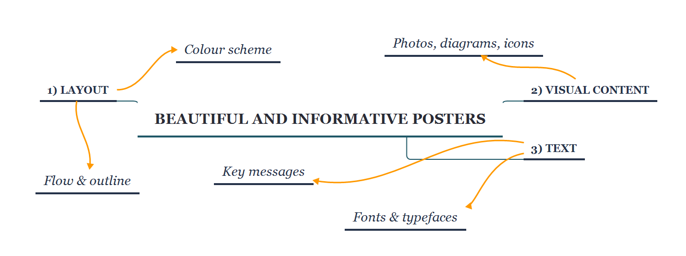
Workshop aims:
1. Designing a good layout for your poster
2. Letting your visual content shine
3. Using text effectively
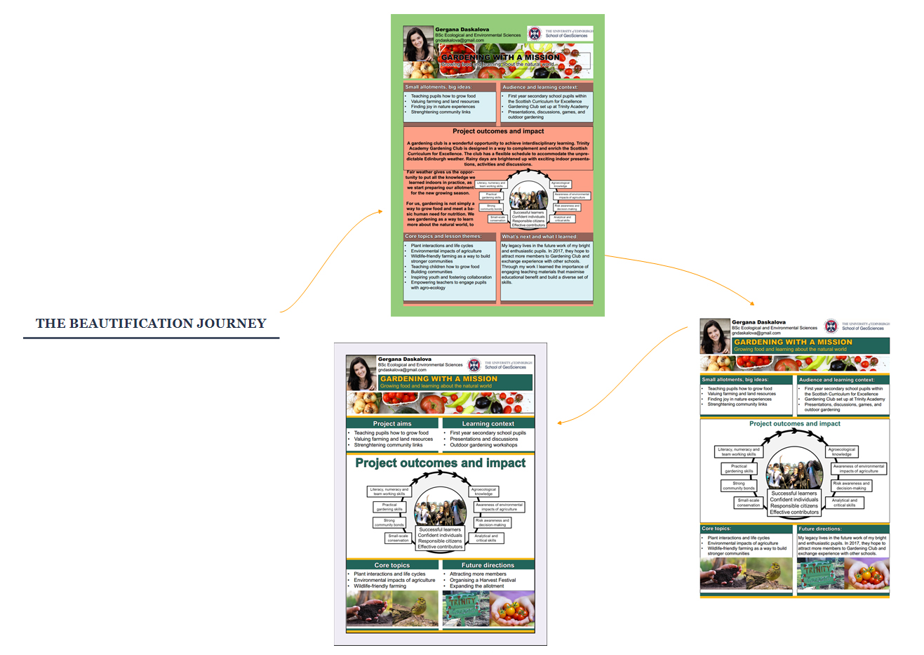
The poster beautification journey
Making a poster (or any kind of visual material) is a fun process of editing and continuous improvements - you make a poster, get feedback on it from your peers and friends, and then the beautification journey begins! If it weren’t for deadlines, that journey might never end - it might seem like there is always something to improve, and it’s very easy to get carried away tweaking little things. Through this workshop we’ll hopefully see that it’s possible to make the foundation of a great poster in a couple of hours.
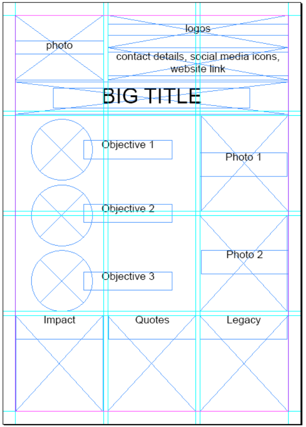
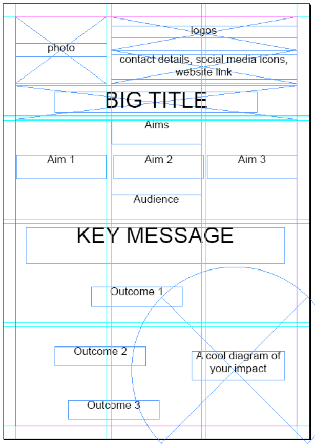
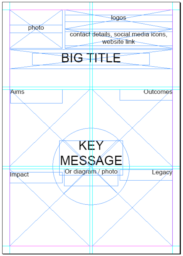
Above you can see an A4 poster from last year’s Geoscience Outreach course at different stages - the middle is what I submitted, and the other two versions I made for the purpose of the workshop. I resisted the temptation to make a completely new one, though if I were taking the course again, I would break the flow of my poster and make it more dynamic, as opposed to the strictly symmetrical boxes, I would use nicer icons as opposed to bullet points, and my diagram would have less text. You can view .pdf files of different versions here: bad, good, better. The better version has less text, the text next to the bullet points doesn’t run over two lines, the photos are a bit bigger, and I added a bit of grey since, since the poster felt very white.
Poster layout
As part of your assessment for the Geoscience Outreach course, you have to prepare an A4 poster (worth 5% of your overall mark) that communicates the key messages of your project through visual means in an engaging way. The posters will be used to make a booklet showcasing all the projects from your year, and will be printed and hung up for the end of the year celebration at the ECCI.
NOTE: Even though they are called an A4 poster, I would strongly advise you to make them bigger, e.g. A3. For the end of the year celebration, the posters will be printed as A3, and you might want to print out a larger copy for your own promotion of the project. You can always make something big small, going from small to big is way more problematic, and it would be a shame if your cool diagrams and photos end up blurry.
We will be using Adobe InDesign, which is available on all uCreate computers at KB and the main campus, and you can also download a free 30-day trial here. You could also use Powerpoint or Inkscape (free to download from here) to make your poster. Adobe InDesign is used specifically to prepare visual materials for publication (posters, magazine covers, leaflets, etc.), and learning how to use the main functions doesn’t take long. To create your poster, you will mainly be using the Rectangle Frame tool to draw the boxes where you will place images, the Rectangle / Eclipse / Polygon tool to draw different shapes, and the Type tool to add in your text.
Where InDesign shines is making sure all your images, boxes and text are arranged nicely, with consistent spacing, even sizes, etc. That’s achieved by following a layout - and you have the freedom to make any layout you want, or use one of the layouts I prepared. There are no set rules for your poster, and great posters come in all shapes and colours (but not all colours at the same time!), so please don’t interpret this workshop as “You must make a poster like this to get a good mark”, rather the aim of the workshop is to give you the opportunity to practice using InDesign, so that you can take full advantage of your creativity and imagination.
Making your layout
Open InDesign and make a new file following File / New / Document and select A3 as the paper size. Here’s your new document:
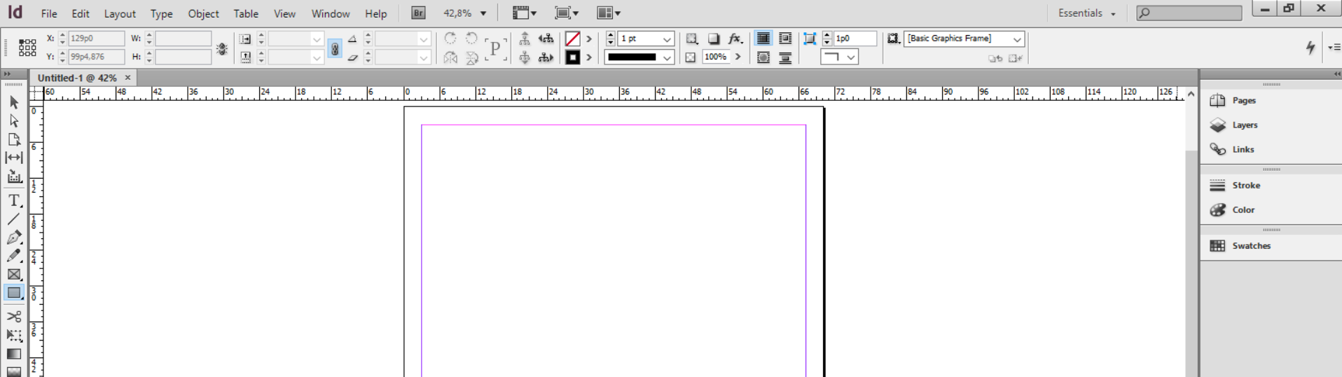
Notice the pink-purple-ish rectangle within your page - those lines are your margin, set at the default size. You can use the margins as a cutoff point - you don’t want to have any text or images beyond that point, since they might get cut off after printing, and in general you want your poster to have a bit of breathing space. If you want to adjust the margins, click on Layout / Margins and columns.
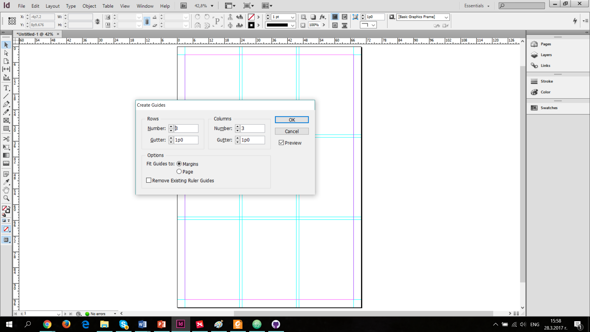
Click on Layout / Create guides to split your page into different sections. Make sure Preview is clicked, so that you can see what the guides look like before you implement them. Gutter refers to the spacing between the different rows and columns. You can fit the guides to the page or the margins, so you can try both and decide which works better for you. If you want to hide all of the guides (useful once all your content is in and you want to see it without all the lines), click on View / Grids and Guides / Hide guides. If you want to delete all guides and start again, click on Delete all guides on spread.
Flow & outline
With our guides in place, we can now starting drawing boxes (or other shapes) - the way InDesign works is that you first create all the shapes, and then you place your content in. This makes it very easy to swap photos and try out different content later on, and you don’t have to start from scratch everytime you change your mind.
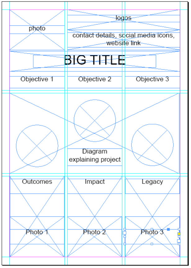
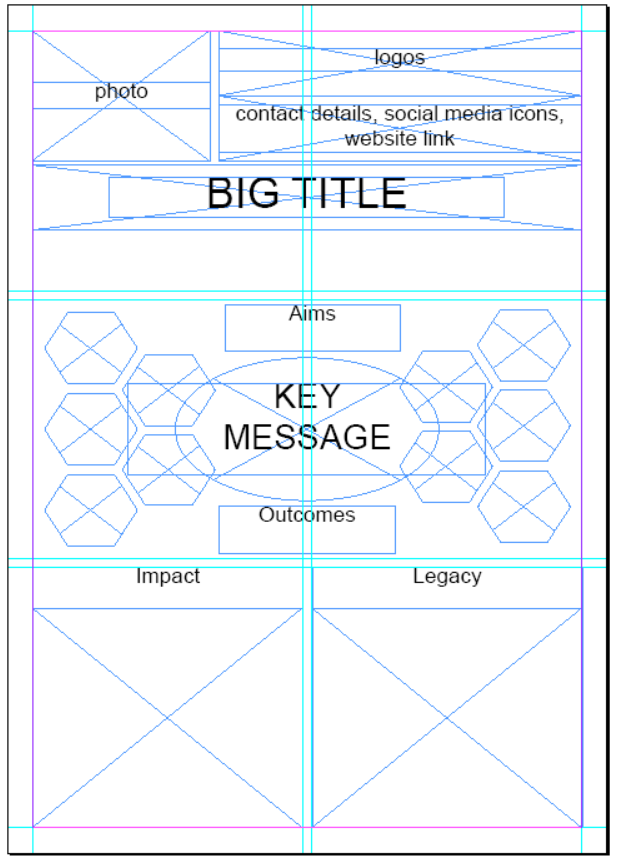
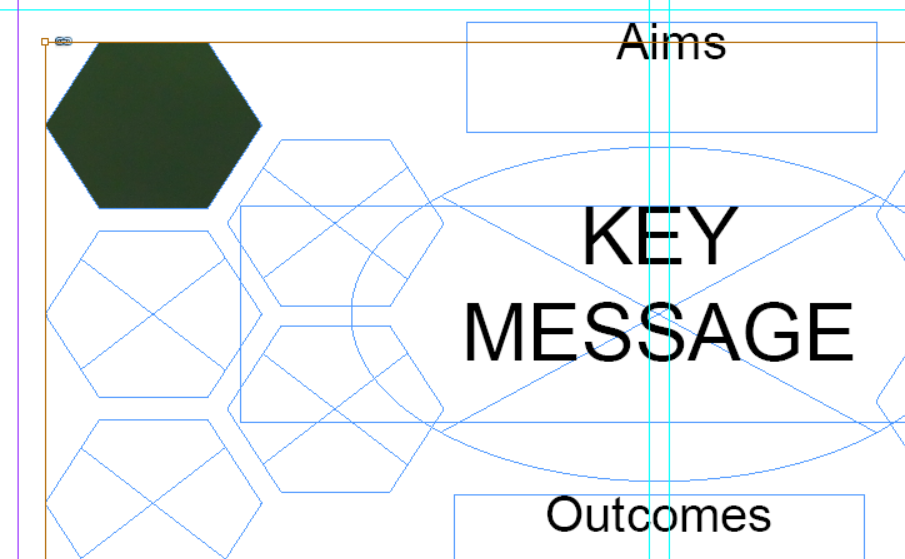
What is the key content that should be included in your content? What is the logical order for it appear? Before you start placing boxes, you can quickly draft a rough outline for the different sections, so that you know how many boxes to include. You can easily alter them later, so don’t worry if you change your mind. Here is a sample outline for a poster - you don’t have to include the same sections.

Select the Rectangle Frame tool to create a few shapes on your page. It’s useful to make frames for all the different subdivisions of your poster - afterwards those become additional guides - e.g. you can make text boxes that are half the size of the frame. As you’re changing the size of the boxes, you’ll notice that the lines change colour when they align with other objects, and rules appear to tell you whether your spacings are consistent. Just like in Powerpoint, objects are layered and you can change their position by selecting an object, right clicking and going to Arrange. Shift + [ moves an object backward, and Shift + ] - forward. If you want to change the size of an object, but keep the aspect ratio (or keep the circle with equal radii), just hold Shift whilst dragging in or out to make the object smaller / bigger. If you’re trying to move an object only a tiny bit, you might need to zoom in, which gives you more precision when changing object positions.
You can download sample layouts below by clicling on an image of your choice. Afterwards you can open the file in InDesign, adjust to your needs and add content.
Colour scheme
It’s time to think about colours! Picking a colour scheme for your project in general is a great idea - using consistent colours in your presentations, any materials you create, and your poster will make you look professional. You can use the Adobe Colour Wheel to pick a colour scheme. I personally like strong contrasting colours complemented by a few grey shades, but that’s just my preference. Avoid reds and greens together as they will appear the same to colour blind people.
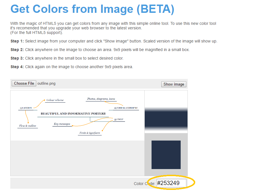
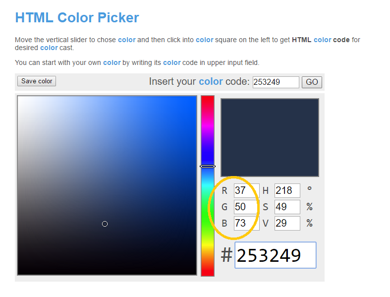
The most recent Living Planet Index Summary Report outlines biodiversity changes in the last few decades, and also has a pretty nice design. You can quickly take a look through it for some colour / graphic design inspiration. An easy way to find a winning colour scheme is to find a logo / website / brochure / etc. you like and see what colours they are using. You can also pick colours based on the photos you want to include in the poster. You could either use Photoshop to open the image and get the RGB values using the Colourpicker tool, or you could do it with free software online. On this website you can upload an image, click anywhere on it, and get the HTML code. InDesign unfortunately doesn’t work with HTML codes, but you can easily get the RGB values for your chosen colour from the same website by going to Colour Tools / Colourpicker.
Once you’ve chosen your colours, write down the RGB values for them somewhere, as that’ll make it easier to input them in InDesign later.
Here are a few nice colours (in most cases five colours would be too much for a small poster, but just to give you more choice):


Visual content
Now is a good time to add colour to our poster - you can do this by either drawing shapes using the Rectangle / Ellipse / Polygon tool and changing the fill colour, or by just changing the fill colour on all the boxes we’ve made. Select the object (shape, frame or text box) and navigate to the fill icon. Double click on it to open the colour menu, otherwise from the dropdown menu you can only see very few colours. Add in the RGB values for the colour you want or just pick one from the colour gradient there. Below the fill icon is the border icon, so you can add borders if you want to.

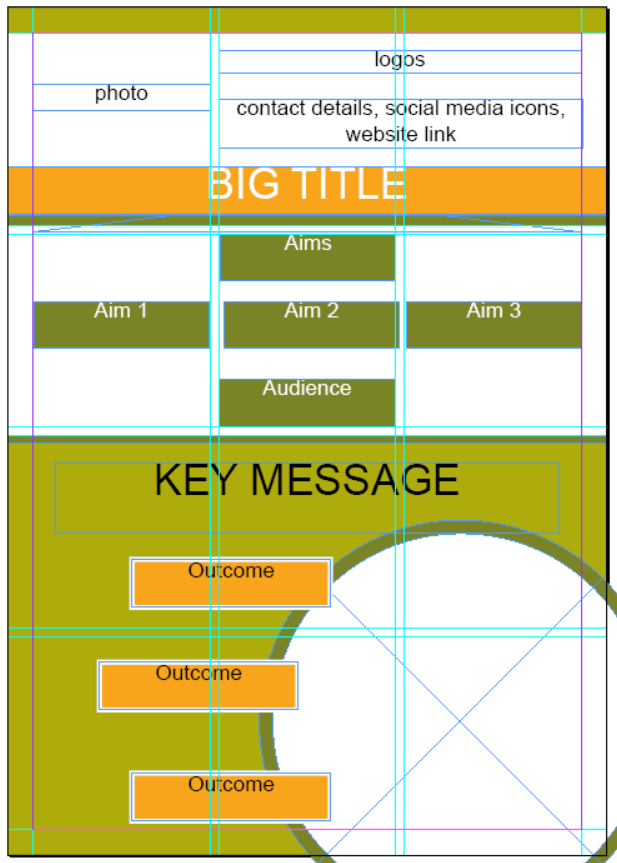
After some quick filling, here is a sample layout:
A handy feature is that you can pick up the attributes of one object and transfer them to another. To do that, select an object, click on the Eyedropper tool in the left sidebar and then click on the object whose attributes (e.g. colour) you would like to transfer to the first object.
Photos
Photos from your project would make a great addition to your poster. Choose sharp meaningful photos - better to have a couple of photos in a larger size, as opposed to many tiny ones. Any photos and diagrams you put in will be the first thing people notice about your poster. What are the images that tell your story without words? Make sure to give credit to the person who took the photos.
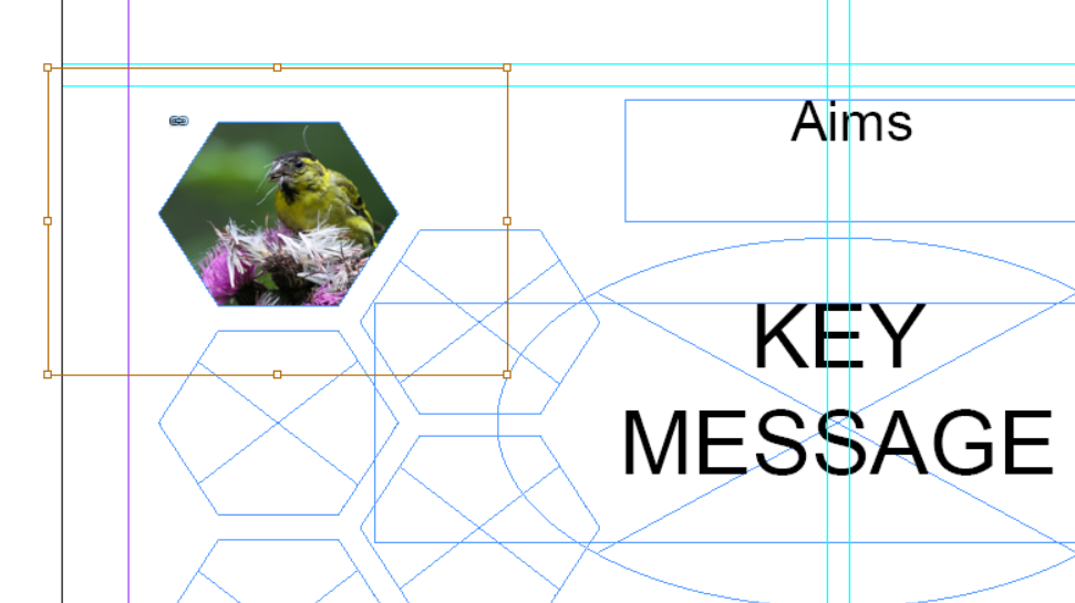
It’s time to fill up all those boxes we made! First, select View / Display Performance / High Quality Display - make sure that High Quality Display is selected, otherwise even the best of photos appear pixelated in InDesign. Using the Selection tool click on a box of your choice, then go to File / Place and choose your image. Notice the small difference in terminology, in InDesign you don’t paste things, you place them.
Note that your images will almost always be bigger than the box you made for them - e.g. here I placed a photo of a siskin and at first you can’t even see the bird! Click at the centre of the frame where a faded out circle appear - then you can see the dimensions of your image and you can drag the corners to resize it. Hold Shift while resizing to keep the aspect ratio the same. And the siskin appears! You can see the dimensions of the photo in the yellow lines, and then it’s only the bits of the photo that are in the frame that are actually visible. So frames can act as a cropping tool.
Diagrams
Probably the most common mistake when making posters is having too much text. Boxes of text could be replaced by a diagram - think about what are the main concepts of your project and how they link with one another. You can make the diagram in InDesign or another software, and then place it onto your InDesign file. Diagrams made up of many components can be annoying to move or resize. In terms of moving, you can select the Selection tool, left click and then drag over an area to select all objects within it. Then you can move them all at once. In terms of resizing, saving the whole diagram as one image and then resizing that is easier, but might lead to som quality loss. Alternatively you can still select all components, hold Shift, resize, and then reorder the diagram again since the resizing usually leads to things being placed in awkward places.
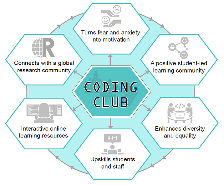
Here is a sample diagram outlining the aims of Coding Club - a peer-to-peer learning community promoting skills in statistics and programming. If in addition to learning how to use InDesign, you are keen to learn how to make beautiful graphs, do efficient data manipulation and more, check out our tutorials online!
Icons
Using custom icons can make your poster stand out, and they can look very fancy especially if they are following your colour scheme! You can turn any photo or drawing into an icon using Adobe Illustrator (here is an intro tutorial), or alternatively you could check out the cool website for the Noun Project that has thousands of icons you can use through the Creative Commons Licence. Registering is very quick and easy (you can also log in through facebook). You can search by keywords related to your project. Afterwards you can download .png or .svg files by clicking on Download / Creative Commons. Once the download is done, you can copy the message that comes up to give credit to the person who made it.
Here are a few cute icons that caught my eye when I opened the website (Nut by Bakunetsu Kaito, Cactus by Bakunetsu Kaito, Puffin by parkjisun from the Noun Project).


Text
Avoid the temptation to write long paragraphs / copy text over from your project report - for a poster, you most likely don’t need more than a couple of full sentences (if any) and the rest can go into pithy bullet points. It looks nicer if bullet points don’t go over on a second line, and your lists are a consistent length. Lists of uneven numbers (3 being optimal) look good.
Key messages
What are the key messages of your project? Do they come through, or are they hidden among a bunch of other text? Once you have your text ready, you can use the Type tool to draw text boxes and paste your text in. A cool feature is being able to adjust the margins of your text box, thus creating a bit of air around your text - you wouldn’t want it to be crammed. Select a text box and go to Object / Text frame options and adjust the Inset spacing as needed.
Fonts & typefaces
Avoid text that has a small font size - instead go for less, but bigger and punchier text. Once you have selected some text, you have the usual text options just below the InDesign menu. Avoid using more than two different fonts and stick to the ones that are easier to read.
Exporting files
Remember to save your .indd (InDesign file format) file often! That way you can always go back and change images, fonts, colours, etc., without having to start all over again.
Once you are ready with your poster, or when you are just curious to see it as a .pdf, click on File / Export, enter a filename and then in the menu that pops up, you can choose the resolution - I usually go for Lossless compression and 300 dpi for the resolution.
If you have any questions on using InDesign, feel free to email gndaskalova@gmail.com.
Happy poster making!
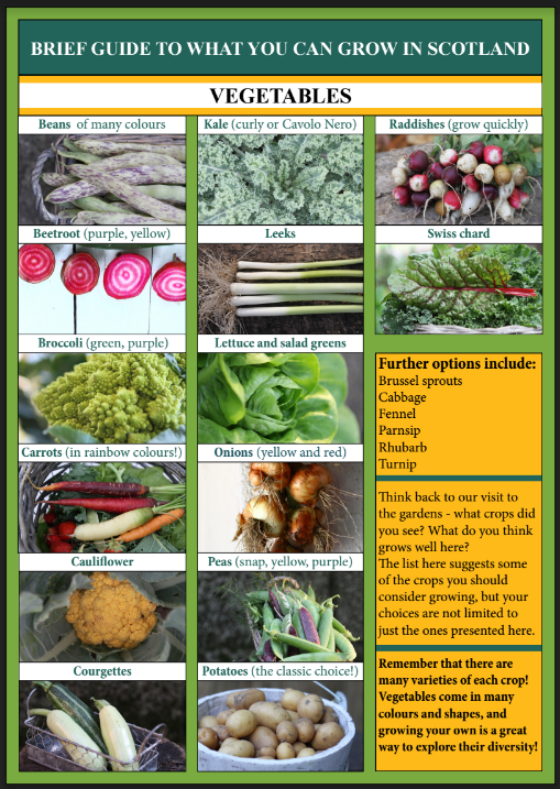
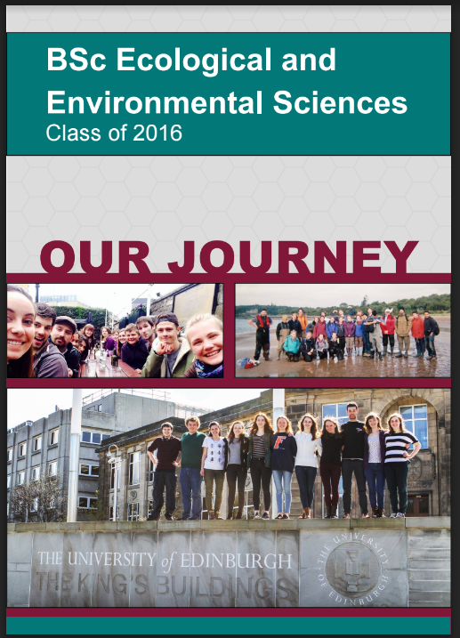
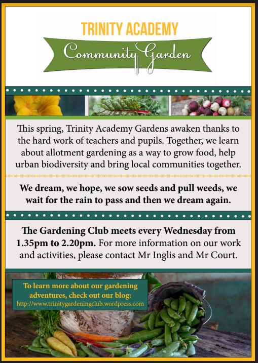
Examples of materials created using InDesign